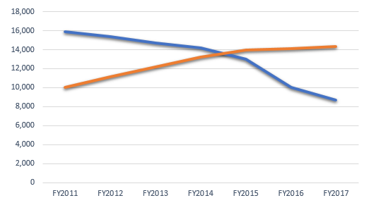
Please take a moment and look at this chart. It represents some measure of the E-rate program. But do not worry about what is being measured, and please do not cheat and scan this article for the answer. Just look at the chart.

What do you think the lines represent? Who would you rather be? Which line is “better”? Blue or orange?
******
The lines represent the number of E-rate applicants each year going back to FY2011. Blue is the count of applicants who complete their applications on their own. Orange is the count of applicants who complete their applications with assistance from a third-party consultant.
The total number of E-rate applicants has declined, and the percentage of applicants using a consultant has increased from 39% in 2011 to 62% in 2017. What does this say about the state of the E-rate program? I think it means that the program’s rules and administration are getting harder and not easier. Schools and libraries generally do not hire outside parties unless there is a need for it.
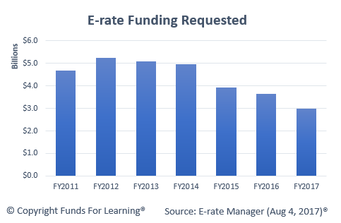
Furthermore, this is happening at a time when less money is being requested. In 2017, demand slipped below $3 billion for the first time since 1999.

Fewer applicants. Less money requested. Greater dependence on third-party help. In my opinion, these are indicators that there are opportunities to improve the administration of the E-rate program.
The FCC is set to have a full complement of five Commissioners very soon. It is my sincere hope that one of the top priorities of the new Commission will be improving the operation of the program. The rules and regulations need to be simplified, and applicants need to be given tools and resources that help them succeed (i.e. the EPC system needs to go.)
